Category: Blog

  • pychoir

    pychoir – Python Test Matchers for humans

    PyPI version PyPI Supported Python Versions GitHub Actions (Tests) Documentation Status License

    Super-duper low cognitive overhead matching for Python developers reading or writing tests. Implemented fully in modern & typed Python, without any dependencies. Runs and passes its tests on most Pythons after 3.6. PyPy works fine too.

    pychoir has mostly been developed for use with pytest, but nothing prevents from using it in any other test framework (like vanilla unittest) or even outside of testing, if you feel like it.

    Installation

    • With pip: pip install pychoir
    • With pipenv: pipenv install --dev pychoir
    • With poetry: poetry add --dev pychoir
    • With PDM: pdm add -dG test pychoir
    • With uv: uv add --dev pychoir

    Documentation

    Check out the API Reference on readthedocs for detailed info and examples of all the available Matchers https://pychoir.readthedocs.io/en/stable/api.html

    Why?

    You have probably written quite a few tests where you assert something like

    assert thing_under_test() == {'some_fields': 'some values'}

    However, sometimes you do not expect exact equivalence. So you start

    result = thing_under_test()
    
    result_number = result.pop('number', None)
    assert result_number is None or result_number < 3
    
    result_list_of_strings = result.pop('list_of_strings', None)
    assert (
        result_list_of_strings is not None
        and len(result_list_of_strings) == 5
        and all(isinstance(s, str) for s in result_list_of_strings)
    )
    
    assert result == {'some_fields': 'some values'}

    …but this is not very convenient for anyone in the long run.

    This is where pychoir comes in with matchers:

    from pychoir import LessThan, All, HasLength, IsNoneOr, IsInstance
    
    assert thing_under_test() == {
        'number': IsNoneOr(LessThan(3)),
        'list_of_strings': HasLength(5) & All(IsInstance(str)),
        'some_fields': 'some values',
    }

    It can also be cumbersome to check mocked calls without using matchers:

    assert mock.call_args[0][0] < 3
    assert isinstance(mock.call_args[0][1], str)
    assert len(mock.call_args[0][2]) == 3

    but simple and easy when using them:

    from pychoir import LessThan, IsInstance, HasLength
    
    mock.assert_called_with(LessThan(3), IsInstance(str), HasLength(3))

    You can also check many things about the same value: for example IsInstance(int) & 5 will make sure that the value is not only equal to 5, but is also an int (goodbye to accidental 5.0).

    You can place a matcher almost anywhere where a value can be. pychoir matchers work well inside lists, tuples, dicts, dataclasses, mock call assertions… You can also place normal values inside matchers, and they will match as with traditional == or !=.

    A core principle is that pychoir Matchers are composable and can be used freely in various combinations. For example [LessThan(3) | 5] is “equal to” a list with one item, holding a value equal to 5 or any value less than 3.

    Can I write custom Matchers of my own

    Yes, you can! pychoir Matcher baseclass has been designed to be usable by code outside the library. It also takes care of most of the generic plumbing, so your custom matcher typically needs very little code.

    Here is the implementation of IsInstance as an example:

    from typing import Any, Type
    from pychoir import Matcher
    
    class IsInstance(Matcher):
        def __init__(self, type_: Type[Any]):
            super().__init__()
            self.type = type_
    
        def _matches(self, other: Any) -> bool:
            return isinstance(other, self.type)
    
        def _description(self) -> str:
            return self.type.__name__

    All you need to take care of is defining the parameters (if any) in __init__(), the match itself in _matches(), and a description of the parameters in _description().

    Here is an even simpler Anything matcher that does not take parameters and matches literally anything:

    from typing import Any
    from pychoir import Matcher
    
    class Anything(Matcher):
        def _matches(self, _: Any) -> bool:
            return True
    
        def _description(self) -> str:
            return ''

    If your custom matcher is generic enough to be useful for everyone, please contribute (fork and make a pull request for now) and have it included in pychoir!

    Why not <X>?

    Nothing wrong with hamcrest as such, but pychoir aims to be better integrated with natural Python syntax, meaning for example that you do not need to use a custom assert function. pychoir matchers are drop-in replacements for your normal values alone or inside structures, even deeply nested ones. You can use hamcrest matchers through pychoir if you like, wrapping them in the Matches(my_hamcrest_matcher) matcher, although the idea is that pychoir would soon come with an equivalent set of matchers.

    What a nice fluent API for matching, allowing matching multiple things at once. However, you can only match one value at a time. With pychoir you’ll be matching the whole result at once, be it a single value, list, tuple, dict, dataclass, you name it. Let’s see if pychoir gets some of that fluent stuff going forward as well.

    ???

    I’d be happy to hear from you about other similar libraries.

    What is it based on?

    Python has a rather peculiar way of handling equivalence, which allows customizing it in wild and imaginative ways. This is a very powerful feature, which one should usually avoid overusing. pychoir is built around the idea of using this power to build a lean and mean matcher implementation that looks like a custom DSL but is actually completely standard Python 3.

    What is the project status?

    pychoir has quite a vast range of Matchers built in as well as basic API Reference documenting them. New ideas are still plenty and more can be discussed in Discussions. Documentation will receive updates as well. Most remarkably fancy examples are missing. Making pychoir easier to contribute to is also on the list.

    Where does the name come from?

    It comes from the French word pochoir which means a drawing technique using templates. For some reason this method of matching in tests reminds me of drawing with those. A French word was chosen because it happens to start with a p and a vowel 😉

    Visit original content creator repository
  • medi-camp-pro

    MediCamp

    MediCamp Screenshot

    Overview

    MediCamp is a Medical Camp Management System (MCMS) built with the MERN stack. It is designed to help organizers and participants seamlessly manage medical camps. The platform provides tools for registration, payment, feedback collection, and detailed camp analytics, ensuring a smooth and efficient experience for all users.

    Live Site

    Visit MediCamp Live Site Live Demo

    Backend Link

    Visit MediCamp Backend Link

    Organizer Credentials

    Features

    1. User Authentication: Secure login and registration with support for email/password and social logins.
    2. Home Page: A vibrant banner section showcasing impactful camp success stories, popular camps, and feedback from participants.
    3. Popular Camps Section: Displays the top six camps based on participant counts, with detailed information and a “See All Camps” button.
    4. Available Camps Page: Allows users to view all camps, search by keywords, and sort based on criteria such as participant count, fees, and alphabetical order.
    5. Organizer Dashboard:
      • Add A Camp: Organizers can add camps with details like name, date, fees, location, and description.
      • Manage Camps: View, edit, or delete camps using intuitive controls.
      • Manage Registered Camps: View participants’ details, confirm payments, and cancel registrations.
    6. Participant Dashboard:
      • Analytics: Interactive charts (using Recharts) showcasing the participant’s lifetime camp data.
      • Registered Camps: Displays registered camp details, feedback options, and payment history.
    7. Camp Details Page: Offers comprehensive information about each camp and facilitates participant registration through a modal.
    8. Feedback & Ratings: Participants can provide feedback after successful payment, and these are displayed on the home page.
    9. Payment Integration: Secure payment processing with Stripe, including transaction ID documentation.
    10. Responsive Design: Fully optimized for mobile, tablet, and desktop devices.

    Technologies Used

    • Frontend: React, TailwindCSS, DaisyUI, TanStack Query, Axios, React Hook Form, Recharts
    • Backend: Node.js, Express.js, MongoDB
    • Authentication: Firebase, JWT
    • Other Libraries: Stripe for payments, SweetAlert2 for notifications

    Key Features Breakdown

    Authentication

    • Fully secure login and registration with Firebase.
    • JWT-based authentication for protecting private routes.

    Organizer Functionalities

    • Add, update, or delete camps effortlessly.
    • Manage participants with detailed information and controls.

    Participant Functionalities

    • Easy camp registration and payment process.
    • Feedback and rating submission post-camp experience.
    • Detailed analytics and payment history.

    Additional Features

    • Pagination and search for all tables.
    • 404 page for unmatched routes.
    • Customizable dashboard layouts for both organizers and participants.

    📦 Setup Instructions

    Prerequisites

    • Node.js (v16 or higher)
    • npm
    • Git
    • MongoDB

    🔧 Installation

    1. Clone the Repository

      git clone <repository-url>
      cd medi-camp-pro
      
    2. Install Dependencies:

      npm install
    3. Set Up Environment Variables: Create a .env file in the project root and add the following variables:

      VITE_API_URL=your_backend_api_url
      VITE_FIREBASE_API_KEY=your_firebase_api_key
      VITE_FIREBASE_AUTH_DOMAIN=your_firebase_auth_domain
      VITE_FIREBASE_PROJECT_ID=your_project_id
      VITE_FIREBASE_STORAGE_BUCKET=your_storage_bucket
      VITE_FIREBASE_MESSAGING_SENDER_ID=your_sender_id
      VITE_FIREBASE_APP_ID=your_app_id
      VITE_STRIPE_PUBLIC_KEY=your_stripe_public_key
      
    4. Run the Application:

      npm run dev
    5. Build for Production:

      npm run build
    Visit original content creator repository
  • tectonic

    Tectonic

    Declarative data loading for REST APIs: https://tonyhb.github.io/tectonic/


    What does it do?

    Great question! It:

    • Queries data via your existing REST API with adaptable query drivers
    • Stores state and data within Redux’ reducers automatically
    • Respects and manages caching
    • And, best of all, passes fetched data and loading state into your components

    What does that mean?

    Never define an action for loading data again. And also, never write a
    reducer again. Which means no normalization of data! And no writing reselect
    queries! It happens automatically for you.

    Cool. How do I use it?

    First you need to define some models to hold and query data:

    import { Model } from 'tectonic';
    
    class User extends Model {
      // modelName is important; it's used to differentiate models
      static modelName = 'user';
    
      // fields are used to create an immutable.js record which holds data for an
      // instance of a model. All fields must be defined here with defaults
      static fields = {
        id: 0,
        email: '',
        name: '',
      }
    
      // idField defines which field is used as the model identifier. This defaults
      // to 'id' and should only be set if it's different.
      // Note that a model must always have an ID; this is how we look up data in
      // reducer.
      static idField = 'id';
    }

    Then you define your REST API as sources. It’s quick and easy, but let’s skip it
    to get to the juicy part. Which is declaratively asking for data!

    Check it out (I’ll tell you what’s going on after):

    import React, { Component, PropTypes } from 'react';
    import load, { Status } from 'tectonic';
    import { User, Post } from './models.js'; // your models
    const { instanceOf, arrayOf, shape, string } = PropTypes;
    
    @load((props) => ({
      user: User.getItem({ id: props.params.userId }),
      posts: Post.getList({ email: props.user.email })
    }))
    class UserInfo extends Component {
      static propTypes = {
        // btw, these are the same keys we passed to '@load'
        user: instanceOf(User),
        posts: arrayOf(instanceOf(User)),
    
        status: shape({
          user: instanceOf(Status), // Status is a predefined Tectonic class :)
          posts: instanceOf(Status),
        })
      }
    
      render() {
        const { status } = this.props;
        if (status.user.isPending()) {
          return <Loading />;
        }
        // ...
      }
    }

    Hella cool right?! Here’s what’s happening:

    You say what props you want within the @load decorator. The @load decorator
    gets the component’s props, so you can use props in the router or from parents
    to load data.

    Plus, it automatically handles what we call “dependent data loading”. Here,
    posts depends on the user’s email. We don’t get that until the user has
    loaded. Don’t worry; this is handled automatically behind the scenes.

    Tectonic also adds loading statuses for each of the props to your component!

    You can see whether it’s pending, successful, or errored using built in
    functions (the actual status is at .status, so
    this.props.status.user.status). Plus, if there’s errors, you get the error
    message at .error, so this.props.status.user.error. Same goes for the HTTP
    code.

    And as a bonus all of the requests are automatically cached and stored according
    to the server’s cache headers. So if your server tells us to store something for
    an hour we’re not going to make a request for this data for, like, one hour and
    one minute!

    Super, super basic interface, and super, super powerful stuff behind the scenes.
    I know, not as cool as GraphQL and relay. But still, if you gotta REST you gotta
    deal, baby.

    Bonus: Guess what? If three components asked for the same data we’ll
    automatically dedupe requests for you. We’ll only ask the API once. So don’t
    worry. Spam @load like you’re obsessed!

    Mind blown. You mentioned defining API endpoints as sources?

    That’s right. See, behind the scenes we need to figure out how to actually load
    your data. This is done by a “resolver”.

    In order for us to figure that out you need to tell us where your endpoints are;
    what they return; and what required parameters they have.

    Here’s an example:

    import { Manager, BaseResolver } from 'tectonic';
    import TectonicSuperagent from 'tectonic-superagent';
    
    // Step 1: create your manager (which brings everything together)
    const manager = new Manager({
      resolver: new BaseResolver(),
      drivers: {
        // Drivers are modular functions that request data for us.
        // This one uses the awesome superagent ajax library.
        // See packages/tectonic-superagent for more info :)
        fromSuperagent: new TectonicSuperagent(),
      },
      store, // Oh, the manager needs your redux store
    });
    
    // Step 2: Define some API endpoints as sources.
    // Note that each driver becomes a function on `manager` - this
    // is how we know which driver to use when requesting data.
    manager.drivers.fromSuperagent([
      // Each driver takes an array of API endpoints
      {
        // LMK what the endpoint returns. In this case it's a single
        // user item.
        returns: User.item(),
        // To get a single user the API endpoint needs a user's ID
        params: ['id'],
        meta: {
          // meta is driver-specific. In this case the superagent driver
          // needs to know the URL of the API endpoint. It's going to
          // replace `:id` with the ID parameter when loading data.
          url: '/api/v1/users/:id',
        }
      },
      {
        // This returns a list of posts
        returns: Post.list(),
        // Each param item is the name of the param you pass into @load. EG:
        // @load({
        //    posts: Post.getList({ userId: 1 })
        //  })
        params: ['userId'],
        meta: {
          url: '/api/v1/users/:userId/posts',
        },
      },
    ]); 

    A lot of concepts.

    The manager makes everything tick. It passes “queries” from @load into the
    “resolver”, which then goes through your sources above to figure out which
    requests to make.

    Once we’ve got data, the manager takes that and puts it into the cache, which is
    an abstraction over a Redux reducer in the store to manage caching.

    What happens if I make a request without a source?

    We’ll throw an error which you can see in your console. Also, we use the debug npm package which you can enable via:

    tdebug.enable('*');
    

    How do I add the manager to my app?

    Wrap your app with a component which passes context. We call it a “loader”:

    import { Provider } from 'react-redux';
    import { Loader } from 'tectonic';
    import store from './store.js';
    import manager from './manager.js'; // your manager with sources defined
    
    const App = () => (
      <Provider store={ store }>
        <Loader manager={ manager }>
          {/* Your app goes here */}
        </Loader>
      </Provider>
    );
    
    export default App;

    Sweet potato. But can I CRUD?

    Hell yeah baby!

    The @load decorator also adds a query function to your components:

    @load() // just gimme these functions please!
    class YourForm extends Component {
      static propTypes = {
        query: PropTypes.func,
      }
    
      // imagine onSubmit is called with an object containing model
      // data...
      onSubmit(data) {
        // Each function takes two arguments: an object of options and a
        // second callback for tracking the status of the request 
        this.props.query({
          model: User,
          body: data,
          queryType: 'CREATE', // tells us to use a source definition to CREATE a model
        }, this.afterSubmit);
      }
      
      afterSubmit = (err, result) => {
        if (err !== null) {
          // poo 💩
          return;
        }
      }
    }

    💥💥💥! This is automatically gonna populate the cache, too.

    Can I see documentation?

    Sure thing, partner. Head here.

    License: MIT.

    Visit original content creator repository

  • mec2

    mec2

    --{{0}}--
    

    This document defines some basic macros for applying the
    mec2 2D physics simulation in
    LiaScript.

    Try it on LiaScript:

    https://liascript.github.io/course/?https://raw.githubusercontent.com/LiaTemplates/mec2/main/README.md

    See the project on Github:

    https://github.com/liaTemplates/mec2

    --{{1}}--
    

    There are three ways to use this template. The easiest way is to use the
    import statement and the url of the raw text-file of the master branch or any
    other branch or version. But you can also copy the required functionionality
    directly into the header of your Markdown document, see therefor the
    last slide. And of course, you could also clone this project
    and change it, as you wish.

    {{1}}
    
    1. Load the macros via

      import: https://raw.githubusercontent.com/LiaTemplates/mec2/main/README.md

    2. Copy the definitions into your Project

    3. Clone this repository on GitHub

    @mec2

    --{{0}}--
    

    Simply add @mec2 directly to the head of your Markdown code-snippet to execute
    it directly within LiaScript.

    {
      "id":"chaos-pendulums",
      "gravity":true,
      "nodes": [
        { "id":"A0","x":200,"y":400,"base":true },
        { "id":"A1","x":280,"y":480,"m":2 },
        { "id":"B1","x":279,"y":481,"m":2 },
        { "id":"C1","x":278,"y":482,"m":2 },
        { "id":"D1","x":277,"y":483,"m":2 },
        { "id":"A2","x":360,"y":560,"m":3 },
        { "id":"B2","x":359,"y":561,"m":3 },
        { "id":"C2","x":358,"y":562,"m":3 },
        { "id":"D2","x":357,"y":563,"m":3 },
        { "id":"A3","x":440,"y":640,"m":4.7 },
        { "id":"B3","x":439,"y":641,"m":4.7 },
        { "id":"C3","x":438,"y":642,"m":4.7 },
        { "id":"D3","x":437,"y":643,"m":4.7 }
      ],
      "constraints": [
        { "id":"a1","p1":"A0","p2":"A1","len":{ "type":"const" } },
        { "id":"a2","p1":"A1","p2":"A2","len":{ "type":"const" } },
        { "id":"a3","p1":"A2","p2":"A3","len":{ "type":"const" } },
        { "id":"b1","p1":"A0","p2":"B1","len":{ "type":"const" } },
        { "id":"b2","p1":"B1","p2":"B2","len":{ "type":"const" } },
        { "id":"b3","p1":"B2","p2":"B3","len":{ "type":"const" } },
        { "id":"c1","p1":"A0","p2":"C1","len":{ "type":"const" } },
        { "id":"c2","p1":"C1","p2":"C2","len":{ "type":"const" } },
        { "id":"c3","p1":"C2","p2":"C3","len":{ "type":"const" } },
        { "id":"d1","p1":"A0","p2":"D1","len":{ "type":"const" } },
        { "id":"d2","p1":"D1","p2":"D2","len":{ "type":"const" } },
        { "id":"d3","p1":"D2","p2":"D3","len":{ "type":"const" } }
      ],
      "views": [
        { "show":"pos","of":"A3","as":"trace","id":"view1","stroke":"rgba(255,0,0,.5)" },
        { "show":"pos","of":"B3","as":"trace","id":"view2","stroke":"rgba(0,255,0,.5)" },
        { "show":"pos","of":"C3","as":"trace","id":"view3","stroke":"rgba(255,255,0,.5)" },
        { "show":"pos","of":"D3","as":"trace","id":"view4","stroke":"rgba(255,0,255,.5)" }
      ]
    }

    @mec2.eval

    --{{0}}--
    

    Attach @mec2.eval to the end of your Markdown code-snippet to create an
    editable and executeable simulation.

    {
      "id":"chaos-pendulums",
      "gravity":true,
      "nodes": [
        { "id":"A0","x":200,"y":400,"base":true },
        { "id":"A1","x":280,"y":480,"m":2 },
        { "id":"B1","x":279,"y":481,"m":2 },
        { "id":"C1","x":278,"y":482,"m":2 },
        { "id":"D1","x":277,"y":483,"m":2 },
        { "id":"A2","x":360,"y":560,"m":3 },
        { "id":"B2","x":359,"y":561,"m":3 },
        { "id":"C2","x":358,"y":562,"m":3 },
        { "id":"D2","x":357,"y":563,"m":3 },
        { "id":"A3","x":440,"y":640,"m":4.7 },
        { "id":"B3","x":439,"y":641,"m":4.7 },
        { "id":"C3","x":438,"y":642,"m":4.7 },
        { "id":"D3","x":437,"y":643,"m":4.7 }
      ],
      "constraints": [
        { "id":"a1","p1":"A0","p2":"A1","len":{ "type":"const" } },
        { "id":"a2","p1":"A1","p2":"A2","len":{ "type":"const" } },
        { "id":"a3","p1":"A2","p2":"A3","len":{ "type":"const" } },
        { "id":"b1","p1":"A0","p2":"B1","len":{ "type":"const" } },
        { "id":"b2","p1":"B1","p2":"B2","len":{ "type":"const" } },
        { "id":"b3","p1":"B2","p2":"B3","len":{ "type":"const" } },
        { "id":"c1","p1":"A0","p2":"C1","len":{ "type":"const" } },
        { "id":"c2","p1":"C1","p2":"C2","len":{ "type":"const" } },
        { "id":"c3","p1":"C2","p2":"C3","len":{ "type":"const" } },
        { "id":"d1","p1":"A0","p2":"D1","len":{ "type":"const" } },
        { "id":"d2","p1":"D1","p2":"D2","len":{ "type":"const" } },
        { "id":"d3","p1":"D2","p2":"D3","len":{ "type":"const" } }
      ],
      "views": [
        { "show":"pos","of":"A3","as":"trace","id":"view1","stroke":"rgba(255,0,0,.5)" },
        { "show":"pos","of":"B3","as":"trace","id":"view2","stroke":"rgba(0,255,0,.5)" },
        { "show":"pos","of":"C3","as":"trace","id":"view3","stroke":"rgba(255,255,0,.5)" },
        { "show":"pos","of":"D3","as":"trace","id":"view4","stroke":"rgba(255,0,255,.5)" }
      ]
    }

    @mec2.eval

    Implementation

    script: https://jauhl.github.io/mecEdit/scripts/g2.js
            https://jauhl.github.io/mecEdit/scripts/mec2.min.js
            https://jauhl.github.io/mecEdit/scripts/mecelement/canvasInteractor.js
            https://jauhl.github.io/mecEdit/scripts/mecelement/g2.selector.js
            https://jauhl.github.io/mecEdit/scripts/mecelement/mec.htmlelement.js
    
    
    @mec2
    <lia-keep>
    <MEC-2 width=800 height=600 grid cartesian darkmode x0=385 y0=139 >
    @0
    </MEC-2>
    </lia-keep>
    @end
    
    @mec2.eval: @mec2.eval_(@uid)
    
    @mec2.eval_
    <script>
    let json=`@input`
    
    document.getElementById("@0").innerHTML = "<MEC-2 id='test' width=1530 height=680 grid cartesian darkmode x0=385 y0=139 >" + json + "</MEC-2>"
    
    "LIA: stop"
    </script>
    
    <div id="@0"></div>
    
    @end

    Visit original content creator repository

  • zotero-pdf-custom-rename

    Zotero PDF Rename

    zotero target version Latest release code size Downloads latest release License Using Zotero Plugin Template

    This is a Zotero plugin that allows you to rename PDF files in your Zotero library using custom rules.

    Note: This plugin only works on Zotero 7.0 and above.

    Usage

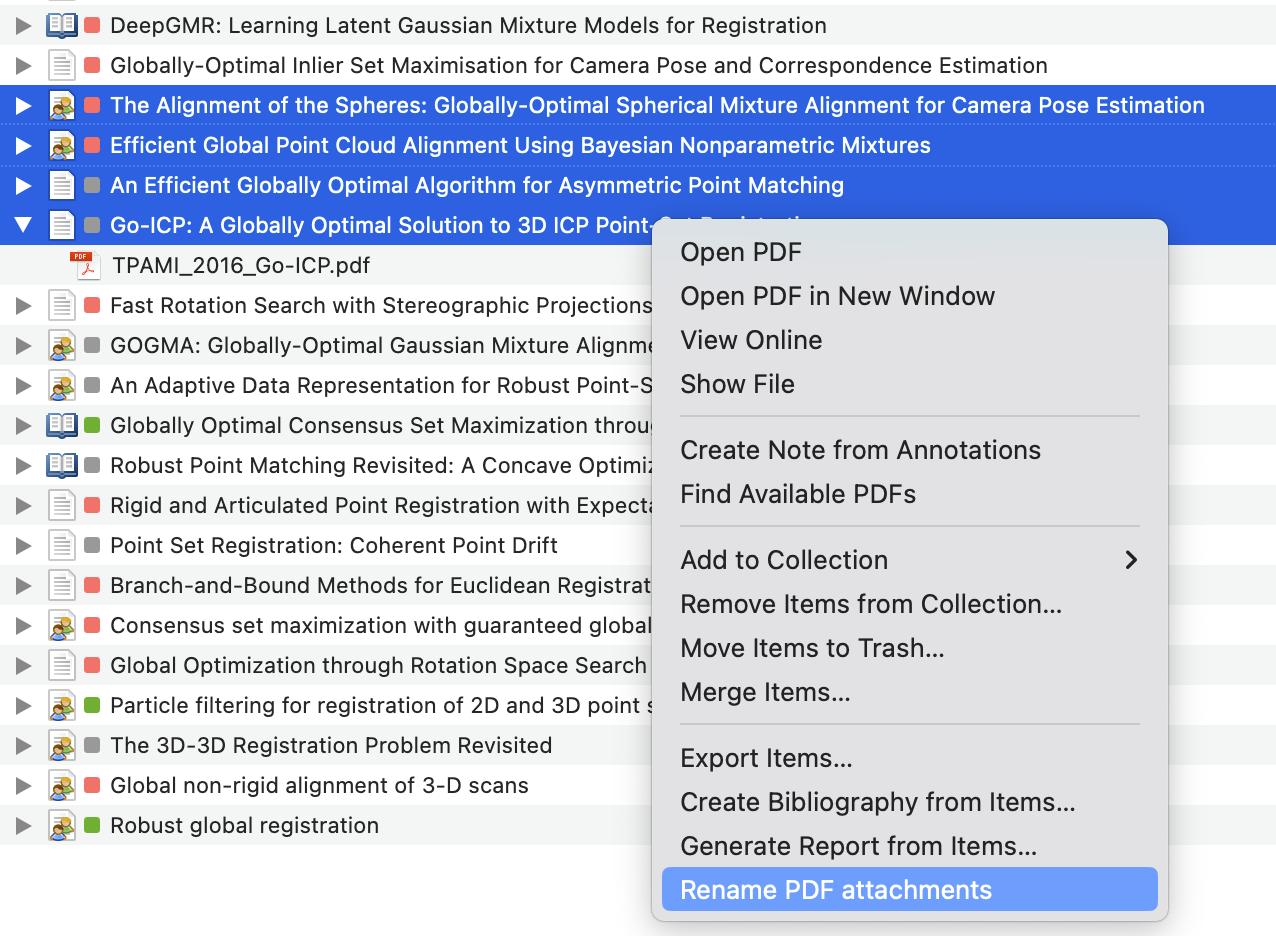
    Select one or more items in your Zotero library and right click to open the context menu. Select Rename PDF attachments from the menu.

    image

    Then the PDF files will be renamed according to the custom rules you set in the plugin preferences(not implemented yet).

    Default rules

    This plugin will read the journal name and year from the metadata of the item and rename the PDF file as follows:

    {short journal name}_{year}_{short title}.pdf
    

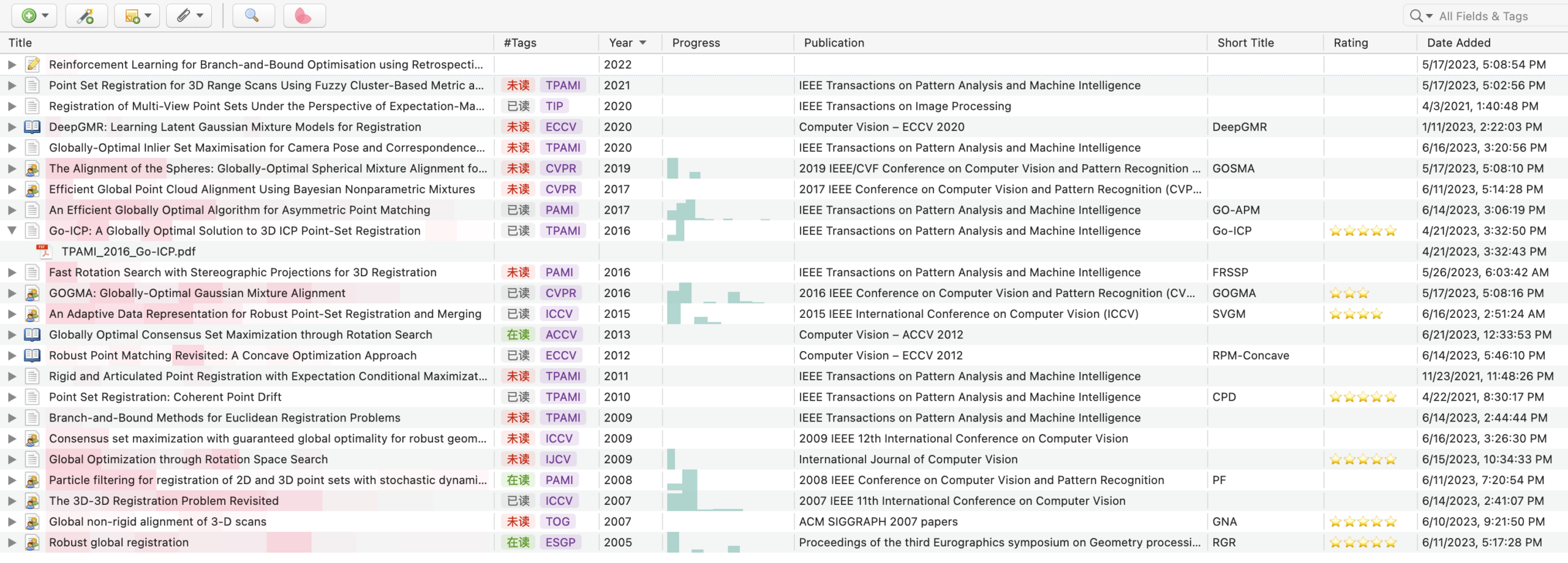
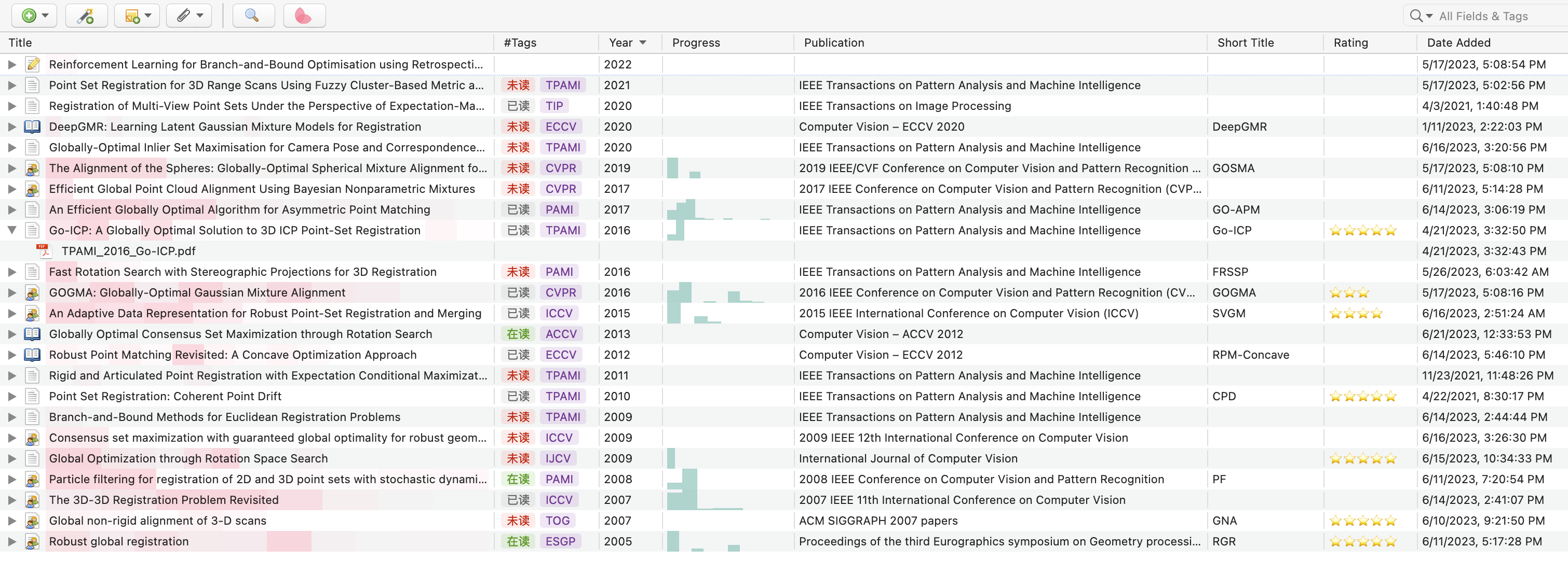
    For example, the PDF file of the item below will be renamed as TPAMI_2016_Go-ICP.pdf.

    The short title is read from the Short Title field of the item. If the Short Title field is empty, the plugin will use the Title field instead.

    Journal tags

    The short journal name is generated by selecting the first capital letter of each word in the journal name. For example, IEEE Transactions on Pattern Analysis and Machine Intelligence will be converted to TPAMI, while IEEE will be ignored.

    However, ACM Transactions on Graphics will be converted to TG rather than TOG in current version. This is because the word on is ignored in the conversion. A better method is manually adding the short name of the journal in the Tags of the item.

    For example, you can add Jab/#TOG to the Tags of the item, and the plugin will use TOG as the short name of the journal.

    Note: the plugin will first read the Jab/# tag in the Tags as the short name. If there is no Jab/# tag, the plugin will automatically extract the short name from the full name of the journal.

    PS: It is recommended to install the plugin MuiseDestiny/zotero-style for a better experience.

    Xnip2023-06-22_21-14-44

    Short Cut

    Now, we can use control+D to rename the PDF files. Moreover, we can customize the short cut in the Preferences of Zotero.

    The custom short cut can be a combination of the modifier keys and another key. The modifier keys can be alt, control, meta and accel, while another key can be any key on the keyboard.

    The following table shows the corresponding modifier keys on Windows and Mac.

    modifier Windows Mac
    alt Alt ⌥ Option
    control Ctrl ⌃ Control
    meta Not supported ⌘ Command
    accel Ctrl ⌘ Command

    Future work

    • Add a short cut for the renaming function
    • Preferences panel to allow users to customize the rules.
    • Better way to extract the short name of the journal.
    Visit original content creator repository
  • xc-bela-cmake

    xc-bela-cmake

    This repository (should) contain all you need to cross compile on Ubuntu for the bela plaftorm with the following toolchain

    • Linaro 7 for C++17 support
    • cmake >= 3.6
    • qemu-arm-static for local emulation & testing
    • VSCode integration
    • clangd integration

    This is a first really quick draft to start sharing it. If you notice anything please don’t hesitate to open an issue, I’d like to help as much as possible.

    Setup

    Prerequisites

    On Ubuntu you’ll probably requires this packages :

    apt-get install build-essentials cmake git qemu-user-static clangd gdb-multiarch

    Then clone the repo :

    git clone --recurse-submodules git@github.com:maxmarsc/xc-bela-cmake.git

    Linaro

    # Linaro
    mkdir /usr/local/linaro
    sudo chmod 777 /usr/local/linaro/
    cd /usr/local/linaro
    wget https://releases.linaro.org/components/toolchain/binaries/7.5-2019.12/arm-linux-gnueabihf/gcc-linaro-7.5.0-2019.12-x86_64_arm-linux-gnueabihf.tar.xz
    tar xf gcc-linaro-7.5.0-2019.12-x86_64_arm-linux-gnueabihf.tar.xz
    mv gcc-linaro-7.5.0-2019.12-x86_64_arm-linux-gnueabihf arm-bela-linux-gnueabihf
    rm -r gcc-linaro-7.5.0-2019.12.02-x86_64_arm-linux-gnueabihf.tar.xz

    Bela librairies and headers

    Warning : this could delete the projects located on your board, in doubt make a backup

    # Build the libraries -- needs the Bela board to be connected
    scp BelaExtras/CustomMakefile* root@bela.local:~/Bela
    ssh root@bela.local "cd Bela && rm lib/*"
    ssh root@bela.local "cd Bela && make -f Makefile.libraries cleanall && make -f Makefile.libraries all"
    ssh root@bela.local "cd Bela && make lib && make libbelafull"
    
    # Bela Sysroot -- needs the Bela board to be connected
    ./BelaExtras/SyncBelaSysroot.sh
    
    # Additional step to install gdbserver on the board for remote debugging
    ssh root@bela.local "apt-get install -y gdbserver"
    

    Build & testing

    To build with cmake on the command line run :

    cmake -B build -DCMAKE_TOOLCHAIN_FILE:FILEPATH=Toolchain.cmake .
    cmake --build build -j$(nproc) --target bela_executable

    Testing

    CMake is preconfigured to call qemu-arm-static to run any Bela executable on your machine. If you want to do it manually you can do it this way :

    qemu-arm-static -L /usr/local/linaro/arm-bela-linux-gnueabihf/arm-linux-gnueabihf/libc <your_executable>

    VSCode integration

    I try to integrate as much as I could into VSCode workflow. I suggest the following extensions :

    Once the toolchain is selected for cmake you can use the CMake integration quite easily

    Debugging targets

    I provided two debugging targets (using the native-debugger extension):

    • [Tests] Attach to local gdbserver : localy run tests using qemu, default to build/bin/tests
    • [Belacid] Attach to gdbserver : remotly start the exectuable with gdbserver on the Bela board and connect to it with gdb-multiarch

    Kudos

    Thanks to these repos for hints & tips,

    Visit original content creator repository

  • react-form-material-ui

    material-ui Inputs for React Form Base

    material-ui input bindings for react-form-base.

    build status npm version

    Installation

    npm install --save react-form-material-ui
    

    Usage

    For a more detailed information on core functionality of react-form-base, take a look at react-form-base demo. To see a sample usage of this package components, you may want to look at react-form-material-ui components demo.

    Example

    import Form, {
      TextField,
      DatePicker,
      SelectField,
      Checkbox,
      Toggle,
      Slider,
      RadioButtonGroup,
      RadioButton
    } from 'react-form-material-ui';
    
    const colors = [
      'Red', 'Orange', 'Yellow', 'Green', 'Blue', 'Purple', 'Black', 'White'
    ];
    
    export default class MyForm extends Form {
      render() {
        return (
          <div>
            <TextField {...this.$('fullName')} floatingLabelText="Full Name" />
            <DatePicker {...this.$('birthDate')} hintText="Birth Date" />
            <SelectField {...this.$('hairColor')} options={colors} floatingLabelText="Hair Color" />
            <AutoComplete
              hintText="Eye Color"
              dataSource={colors}
              filter={(value, key) => (key.indexOf(value) !== -1)}
              openOnFocus
            />
            <RadioButtonGroup {...this.$('sex')}>
              <RadioButton value="male" label="Male" />
              <RadioButton value="female" label="Female" />
            </RadioButtonGroup>
            <Slider {...this.$('tanLevel')} />
            <Checkbox {...this.$('admin')} label="Admin" />
            <Toggle {...this.$('extraFeatures')} label="Extra Features" />
          </div>
        );
      }
    }

    DialogForm Example

    import Form, { Dialog, TextField } from 'react-form-material-ui';
    import FlatButton from 'material-ui/FlatButton';
    
    export default class MyDialogForm extends Dialog(Form) {
      // title may be passed in props, or can be rendered dynamically (based on
      // form's attrs, for example) via getTitle method:
      getTitle() {
        return this.get('id') ? this.get('name') : 'New Item';
      }
    
      // actions may be passed in props, or they can be set dynamically. Bellow is
      // what DialogForm uses for actions by default if they are not passed in props.
      // You don't need to overload it if 2 buttons is what your DialogForm needs to have.
      getActions() {
        return [
          <FlatButton label={closeLabel} onTouchTap={this.props.onRequestClose} />,
          <FlatButton label={saveLabel} primary onTouchTap={() => this.save()} />
        ];
      }
    
      // NOTE: in DialogForm you have to use form's $render helper method for rendering
      // form content. Generally, this is optional (yet recommended) way of rendering,
      // but is mandatory in case of DialogForm.
      $render($) {
        <div>
          <div><TextField {...$('email')} floatingLabelText="Email" /></div>
          <div><TextField {...$('firstName')} floatingLabelText="First Name" /></div>
          <div><TextField {...$('lastName')} floatingLabelText="Last Name" /></div>
        </div>
      }
    }

    Dialog function

    Note that in the example above MyDialogForm is extended from a class generated by a Dialog(Form) function call. The reason of such implementation is that you most likely will have base form class in your application, where all your validations and custom behavior will be defined. And to be able to reuse all this functionality, any dialog form has to be inherited from this base form of yours. Thus, in real-life situations you probably will have something like that:

    import { Dialog } from 'react-form-material-ui';
    import Form from 'your-base-form';
    
    export default class ItemForm extends Dialog(Form) {
      // form definitions...
    }

    NOTE: the full signature of Dialog function is following:

    function Dialog(Form, { Component = MaterialDialog } = {})

    where MaterialDialog stands for material-ui‘s Dialog component. This means that in special cases you can use your own dialog containers to render form’s body.

    Component Props

    Dialog Form

    Dialog form component renders it’s content within material-ui‘s Dialog component (by default). In addition to react-form-base‘s Form API methods there are 2 additional methods available for Dialog forms:

    • getTitle(): overload it to set form’s dialog title on rendering, if you don’t want to pass it in props.

    • getActions(): overload it if you want your dialog form to have something different from ‘Cancel’-‘Save’ actions. Or you can pass actions in props without overloading this method.

    Prop Name Spec Description
    saveLabel PropTypes.string. Defaults to 'Save' label for ‘save’ primary action button that is one of 2 buttons that DialogForm generates by default.
    cancelLabel PropTypes.string. Defaults to 'Cancel' label for ‘cancel’ action button that is one of 2 buttons that DialogForm generates by default.
    ...rest the rest of props are delegated to internal Dialog component.

    Input Components

    All input components receive value, onChange, error and name properties from react-form-base API (this props generated via form’s $ method).

    Bellow are the specs for other properties that components work with.

    TextField

    This component is a simple wrapper around material-ui‘s TextField component.

    Prop Name Spec Description
    ...rest the rest of props are delegated to internal TextField component.

    DatePicker

    Prop Name Spec Description
    wrapperClassName PropTypes.string className for the root component element (div), which wraps DatePicker component and error’s div, which is rendered if input has validation errors.
    errorClassName PropTypes.string. Defaults to 'error' className for internal error element (div), which is rendered if error is present.
    ...rest the rest of props are delegated to internal DatePicker component.

    SelectField

    Prop Name Spec Description
    options
    PropTypes.arrayOf(
      PropTypes.oneOfType([
        PropTypes.number,
        PropTypes.string,
        PropTypes.shape({
          value: PropTypes.oneOfType([
            PropTypes.string,
            PropTypes.number
          ]),
          text: PropTypes.string
        })
      ])
    )
    options to be rendered (as MenuItems) within internal SelectField component. If array of strings or integers is passed, it’s values are used as options’ texts and values. If array of objects is passed, each object should have value and text properties.
    children PropTypes.node Can be used to render options manually. Overrides options prop.
    includeBlank PropTypes.oneOf([ 'floatingLabelText', 'hintText' ]) When this property is set and input has non-empty value, additional option will be rendered within the input. It will have a blank value and text that corresponds to the value of prop itself. This behavior can be used to “drop” the value of input after some option has been selected.
    ...rest the rest of props are delegated to the internal SelectField component.

    AutoComplete

    This component is a simple wrapper around material-ui‘s AutoComplete component. It’s main purpose is to map form’s props into AutoComplete’s analogs: value is passed as searchText, error as errorText, and appropriate onUpdateInput prop is generated to match form’s onChange API requirements (new value should be passed as first argument).

    Prop Name Spec Description
    ...rest the rest of props are delegated to internal AutoComplete component.

    RadioButtonGroup

    Prop Name Spec Description
    options
    PropTypes.arrayOf(
      PropTypes.oneOfType([
        PropTypes.number,
        PropTypes.string,
        PropTypes.bool,
        PropTypes.shape({
          value: PropTypes.oneOfType([
            PropTypes.string,
            PropTypes.number,
            PropTypes.bool
          ]),
          label: PropTypes.string
        })
      ])
    )
    options to be rendered (as RadioButtons) within internal RadioButton component. If array of strings or integers is passed, it’s values are used as options’ values and labels. If array of objects is passed, each object should have value and label properties.
    children PropTypes.node Can be used to render options manually. Overrides options prop.
    wrapperClassName PropTypes.string className for the root component element (div), which wraps RadioButtonGroup component and error’s div, which is rendered if input has validation errors.
    errorClassName PropTypes.string. Defaults to 'error' className for internal error element (div), which is rendered if error is present.
    ...rest the rest of props are delegated to the internal RadioButtonGroup component.

    Checkbox

    Prop Name Spec Description
    wrapperClassName PropTypes.string className for the root component element (div), which wraps Checkbox component and error’s div, which is rendered if input has validation errors.
    errorClassName PropTypes.string. Defaults to 'error' className for internal error element (div), which is rendered if error is present.
    ...rest the rest of props are delegated to internal Checkbox component.

    Toggle

    Prop Name Spec Description
    wrapperClassName PropTypes.string className for the root component element (div), which wraps Toggle component and error’s div, which is rendered if input has validation errors.
    errorClassName PropTypes.string. Defaults to 'error' className for internal error element (div), which is rendered if error is present.
    ...rest the rest of props are delegated to internal Toggle component.

    Slider

    Prop Name Spec Description
    wrapperClassName PropTypes.string className for the root component element (div), which wraps Slider component and error’s div, which is rendered if input has validation errors.
    errorClassName PropTypes.string. Defaults to 'error' className for internal error element (div), which is rendered if error is present.
    ...rest the rest of props are delegated to internal Slider component.

    Credits

    Hugs and thanks to ogrechishkina for her support and building all of the CSS for demo application.

    License

    MIT

    Visit original content creator repository
  • hx-neutralino

    hx-neutralino

    POC of using Haxe and Neutralino

    Read more about it in the README_HAXE.MD!

    how to get started Neutralinojs

    We begin with the installing the Typescript starter project for Neutralinojs

    tl;dr (Neutralinojs)

    # install neutralino cli
    $ npm i -g @neutralinojs/neu
    
    # create a typescript neutrolin app
    $ neu create myapp --template ts
    $ cd myapp
    
    # build project
    $ neu build

    Get started (Neutralinojs)

    Install neu-cli

    $ npm i -g @neutralinojs/neu

    Create Neutralino app with Typescript template

    $ neu create myapp --template ts
    $ cd myapp

    Bundle source files

    $ neu build

    Learn more about neu-cli from docs

    Haxe

    The haxe part:

    tl;dr (Haxe)

    # install dts2hx via npm
    npm install dts2hx --save-dev
    
    # copy typescript file to correct folder
    mkdir -p node_modules/@types/neutralino
    cp -i src/index.d.ts node_modules/@types/neutralino/index.d.ts
    
    # convert typescript files to hx
    npx dts2hx neutralino/index.d.ts
    

    Get started (Haxe)

    Install dts2hx via npm, we will us that to generate externs for Haxe

    # install dts2hx via npm
    npm install dts2hx --save-dev
    

    Copy file to correct folder to convert to externs

    Currently dts2hx expects the ts files to be in a repo in node_modules,
    to get that working we just copy the files to that folder.

    # copy typescript file to correct folder
    mkdir -p node_modules/@types/neutralino
    cp -i src/index.d.ts node_modules/@types/neutralino/index.d.ts
    

    And convert the typescript files to Haxe externs

    # convert typescript files to hx
    npx dts2hx neutralino/index.d.ts
    

    The Haxe externs

    structure

    you will end up with a tree structure like this

    .
    ├── LICENSE
    ├── README.md
    ├── app
    │   ├── assets
    │   │   ├── app.css
    │   │   ├── app.js
    │   │   └── neutralino.js
    │   ├── index.html
    │   ├── settings-browser.json
    │   ├── settings-cloud.json
    │   └── settings.json
    ├── externs
    │   ├── global
    │   │   ├── IndexGlobal.hx
    │   │   ├── Neutralino.hx
    │   │   └── neutralino
    │   │       ├── App.hx
    │   │       ├── AppMode.hx
    │   │       ├── Computer.hx
    │   │       ├── Debug.hx
    │   │       ├── DirectoryData.hx
    │   │       ├── FileData.hx
    │   │       ├── Filesystem.hx
    │   │       ├── InitOptions.hx
    │   │       ├── LogSuccessData.hx
    │   │       ├── LogType.hx
    │   │       ├── Os.hx
    │   │       ├── RamData.hx
    │   │       ├── Settings.hx
    │   │       ├── SettingsData.hx
    │   │       ├── StdoutData.hx
    │   │       ├── Storage.hx
    │   │       ├── StoragePutData.hx
    │   │       ├── SuccessData.hx
    │   │       └── ValueData.hx
    │   └── ts
    │       └── Tuple1.hx
    ├── hx-neutralino-linux
    ├── hx-neutralino-mac
    ├── hx-neutralino-win.exe
    ├── neutralino.png
    ├── neutralinojs.log
    ├── package-lock.json
    ├── package.json
    ├── src
    │   ├── app-core
    │   │   └── lib.ts
    │   ├── app.ts
    │   ├── index.d.ts
    │   ├── mycss.css
    │   └── mycss2.css
    ├── storage
    ├── tsconfig.json
    └── webpack.config.js
    

    Set up Haxe

    For now this will bypass the whole webpacker setup

    build.hxml

    --class-path hx
    --class-path externs
    --main Main
    --js app/assets/app.js
    --dce full
    -D js-es=6

    haxe-loader

    install haxe-loader (https://github.com/jasononeil/webpack-haxe-loader)

    haxelib install haxe-loader
    npm install --save-dev css-loader file-loader haxe-loader

    and uninstall

    npm uninstall typescript ts-loader

    example

    source: https://github.com/elsassph/webpack-haxe-example/blob/vanilla/package.json

    Improvement

    Visit original content creator repository

  • redcap

    REDCap

    JavaScript Style Guide current version install size

    classes for interacting with REDCap projects

    REDCapAPI

    an opinionated, JSON-only, zero-dependency REDCap API implementation as an ECMAScript module

    Example

    import REDCapAPI from '@robireton/redcap/api'
    
    const endpoint = process.env.REDCAP_ENDPOINT
    const token = process.env.REDCAP_TOKEN
    
    const project = new REDCapAPI(endpoint, token)
    console.log(await project.metadata())

    Constructor

    REDCapAPI(endpoint, token)

    name value
    endpoint a URL or string to connect to – e.g. https://redcap.server.org/api/
    token the API token specific to your REDCap project and username (each token is unique to each user for each project)

    Instance methods

    name value
    options an optional object with extra parameters for REDCap API calls

    async version()

    returns the current REDCap version number as plain text (e.g., 4.13.18, 5.12.2, 6.0.0)

    async project ()

    returns an object with the following fields:

    • project_id
    • project_title
    • creation_time
    • production_time
    • in_production
    • project_language
    • purpose
    • purpose_other
    • project_notes
    • custom_record_label
    • secondary_unique_field
    • is_longitudinal
    • has_repeating_instruments_or_events
    • surveys_enabled
    • scheduling_enabled
    • record_autonumbering_enabled
    • randomization_enabled
    • ddp_enabled
    • project_irb_number
    • project_grant_number
    • project_pi_firstname
    • project_pi_lastname
    • display_today_now_button
    • missing_data_codes
    • external_modules
    • bypass_branching_erase_field_prompt

    async metadata (options)

    returns an array of data dictionary objects

    options
    • fields: an array of field names specifying specific fields you wish to pull (default: all fields)
    • forms: an array of form names specifying specific data collection instruments for which you wish to pull metadata (default: all instruments)

    async records (options)

    returns an array of record objects

    options
    • type: flat (default) — one record per row or eavone data point per row
    • records: an array of record names specifying specific fields you wish to pull (default: all records)
    • fields: an array of field names specifying specific fields you wish to pull (default: all fields)
    • forms: an array of form names specifying specific data collection instruments for which you wish to pull metadata (default: all instruments)
    • events: an array of unique event names that you wish to pull records for (longitudinal projects only)
    • more… c.f. full REDCap API specification

    async events (options)

    async arms (options)

    async fields (options)

    Returns an array of the export/import-specific version of field name objects for all fields (or for one field, if desired). Each object will contain: original_field_name, choice_value, and export_field_name. The choice_value attribute represents the raw coded value for a checkbox choice. For non-checkbox fields, the choice_value attribute will always be blank/empty. The export_field_name attribute represents the export/import-specific version of that field name.

    async instruments ()

    returns an array of instrument (Data Entry Form) objects

    async mapping (options)

    async repeating ()

    async write (data, options)

    async file (options)

    async upload (file, options)

    REDCapProject

    class for working with project structure and data; uses REDCapAPI or local JSON files

    Example

    import REDCapAPI from '@robireton/redcap/project'
    
    const endpoint = process.env.REDCAP_ENDPOINT
    const token = process.env.REDCAP_TOKEN
    
    const project = new REDCapProject(endpoint, token)
    await project.populate()
    
    console.log(project.info.title)
    for (const instrument of project.instruments) {
      console.log(instrument.label)
      for (const record of instrument.records) {
        
      }
    }

    Constructor

    REDCapProject(endpoint, token)

    name value
    endpoint a URL or string to connect to – e.g. https://redcap.server.org/api/
    token the API token specific to your REDCap project and username (each token is unique to each user for each project)

    Alternately, if endpoint/token resolves to an existing filesystem folder with appropriately-named JSON files, these will be used instead of REDCapAPI.

    Instance methods

    async populate ()

    This must be run before any instance members are accessible.

    getInstrument (name)

    returns a REDCapInstrument object, which includes the records

    REDCapProjectInformation

    REDCapField

    REDCapInstrument

    REDCapDatetime

    Visit original content creator repository